All Posts By

Jacob Thomas

Rajshahi’s Last Letterpress

Yesterday I tracked down the last functioning letterpress in the entire Rajshahi Division. As a child growing up in Kushtia, I recall seeing letterpresses in operation on our road, but like the ubiquitous sailboats of that era they suddenly disappeared, rendered obsolete by newer technologies. After reading Fiona Ross’s The Printed Bengali Character about the history of Bengali typesetting, it’s a thrill to get to see all the lead & wooden type in various display and text fonts.

Babu has operated letterpresses for fourty years

Babu has operated letterpresses for forty years

Babu setting in place the ink rollers

Babu setting in place the ink rollers

The below image shows ‘অ’ in two text fonts and one display font; the middle letter is a fairly standard form, but notice the terminal in the smallest font on the right – instead of the standard blob it has a calligraphic terminal. This intrigues me because I’m currently developing a digital font with the same features.

'অ' in two text fonts and one display font

IMG_7852


Royal Printing's type cases and leading

Royal Printing’s type cases and leading

Unicode Bengali in Adobe

My hopes for this post is twofold:

  1. First, this is for those who need help correctly displaying Unicode Bengali correctly in Adobe softwares.
  2. Secondly, that it will encourage folks in Bangladesh to ditch Bijoy’s outdated ASCII character-encoding scheme and use Unicode Bengali instead. In the 80’s and 90’s, Mustafa Jabbar’s non-unicode ASCII solution for composing Bengali in desktop publishing called Bijoy Keyboard became the norm all across Bangladesh. It worked by replacing the 128 ASCII characters with Bengali glyphs, since at the time there was no other way of rendering Bengali in desktop publishing softwares.

Microsoft Windows has fully supported Unicode Bengali since Windows 98, but Adobe has been slower to follow suit. Up until CS4, if you tried to type Unicode “অন্তর দিয়ে” in Photoshop, Illustrator or InDesign it would look like the below image on the top:
Unicode not working imageIn other words, the consonant conjuncts (যুক্তক্ষর) separate and the reordering of vowels in consonant clusters would not render correctly.

InDesign CC 2016+


InDesign CS6+

  1. Select Edit > Preferences > Advanced Type
  2. Under Default Composer select Adobe World-Ready Paragraph Composer:

Illustrator CS6+

  1. Select Edit > Preferences > Type
  2. Check the box for “Show Indic Options
  3. With the text box selected, from the Paragraph window‘s menu options select “Middle Eastern & South Asian
    Single-line Composer

For current Adobe products, often you can just select the text and under the paragraph window’s options menu select one of the “Adobe World-Ready Composer” options listed and the text will display correctly.

Pre-CC Adobe Softwares

If you’re using CS4-CS5, a simple script can enable full support for Unicode Bengali. For typing Indic Unicode Complex script in Photoshop, Illustrator and Indesign (CS4 & above), these templates can be downloaded and used:

(credit for these templates goes to Thomas Phinney’s blog)

Just open the template in the respective application and start typing in the text box. Your text should now display consonant conjuncts and vowel placement correctly. In Illustrator, you can copy this World-Ready Composer Script to another preexisting text box easily with the eyedropper tool.

Bengali versions of global brands

Coca-cola

Being that Coca-cola is probably the world’s most famous logo, I was quite disappointed to see how poorly executed the Bengali translation of Coca-cola is:

Logo-improvements-Cocacola
  • The original Latin-script logo is characterized by a flowing cursive script with high contrast. Although cursive script is very common and legible in Bengali, this seemingly obvious choice was neglected in favor of a very angular, blocky style which is quite the opposite of the original logo. Even within the current Bengali version, the flowing calligraphic curves of the two “C”s (o-kaars) look awkward juxtaposed with the angular style of the remaining letters.
  • Specifically, the triangle of the “ka“s are often written in Bengali calligraphy and lettering in a much more rounded form which naturally matches the original logo’s “o”s, but this opportunity has not been used.
  • The right-hand terminals of the “ka“s appear excessively small and curved much too far around, while the lower terminal of the second “C” (o-kaar) appears unnaturally compressed
  • The uneven and broken matra (headline) over the “la” somewhat echoes the original’s upper-right element, but it negates any gains in legibility that a non-script type style would have made.

It seems like Coca-cola have already modified their Bengali logo once, so I hope they will consider a further and more radical change to match the original!

Likewise, the ‘Coke’ logo used for the diet version is disappointing, using a very different style of typography than the Latin original with poor legibility. The below

Coke-03

Aquafina

The Bengali version of Pepsico’s mineral water brand similarly seems ill-matched to the original logo’s style:

Logo-improvements-Aquafina

  • The original Aquafina logo is characterized by a highly legible and traditional typeface, somewhere between a vertical-axis transitional with a touch of slab-serif. The natural type style for the Bengali version would seem to be something congruous to an elegant compressed Linotype Bengali. However, instead of this, an extremely informal boxy style akin to the “Curlz” font has been used.
  • In the original logo, the initial and final “A” break above the headline, but the Bengali elements used to mirror this appear ill-matched
  • The excessively large counter space in the initial Bengali “aa” appears awkward, and the perpendicular joint of the Bengali “na” to the vertical stem makes it look more like a Hindi ‘na‘ and hinder legibility; both have a very uneven color.

I spent a little time developing a Bengali version which I think better reflects the feel of the original Latin version.

“Vidyasagar” Font?

Since the 1980’s one single typeface has become synonymous with the Bengali script – primarily known under clone names such as “SutonnyMJ”, “SolaimanLipi”, “Boishakhi”, or “Shree Bangali 0550.” Apart from almost negligible differences, these fonts are basically identical. The typeface is Linotype Bengali, designed in 1982 by Dr. Fiona Ross working with Tim Halloway and a team from the Anandabazar Patrika who commissioned it.

However, in Bangladesh’s top public universities (such as Dhaka and Rajshahi’s Graphic Design departments), it’s generally referred to not as Linotype Bengali but as the “Vidyasagar” typeface, thereby implying its originator is Ishwar Chandra Vidyasagar, a literary Renaissance man of the 1800’s. Most likely this misleading appellation is due to his authorship of the popular alphabet primer where folks first encountered the Bengali letters. However, the widespread belief is that he was the primary designer of the current alphabet. The current Wikipedia article reflects public opinion well:

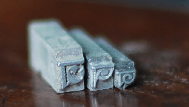
“He [Vidyasagar] also rationalized and simplified the Bengali alphabet and type, which had remained unchanged since Charles Wilkins and Panchanan Karmakar had cut the first (wooden) Bengali type in 1780.” (footnoted source: Murshid Ghulam, “Vidyasagar, Pundit Iswar Chandra” Banglapedia)

Acknowledged, Vidyasagar was an amazing person and made a tremendous contribution to the Bengali language, but his contribution to typeface design was minimal at best. The most significant contribution he made to Bengali typeface design was in standardizing and simplifying the set of consonant conjuncts (যুক্তক্ষর), but this was a task of filtering down a wide range of previously designed letterforms, not designing new ones.

It has also been alleged that Vidyasagar introduced the dotted characters য়, ঢ়, and ড় and . Fiona Ross writes:

“In typographic terms Vidyasagar’s Bengali primer, Varnaparicaya, is of great importance. The author, who is known to have concerned himself with typographic problems, explains in the preface to the first part the necessity for introducing the dotted characters য়, ঢ়, and ড়; the relegation of anusvara ং, visarga ঃ, and candrabindu ঁ to the list of consonants (ব্যঞ্জনবর্ণ) and ক্ষ to the conjuncts; and the omission of ঋ and ৯ which were to be regarded as obsolete. These practices still occur in printed text. The conjuncts listed by Vidyasagara replaced Carey’s as the standard set to be taught in schools. This ‘simplified’ character set, which was used to typeset his works, became known as the “Vidyasagar sort’.” (Ross, 129-130)

I find it hard to believe that Vidyasagar (1820-1891) introduced these dotted forms, because they exist in a 1831 page printed by the Baptist Missionary Press printed when Vidyasagar was eleven years old:

1831 BM4 Manuscript

Baptist Mission Press ধর্মপুস্তক, লুকলিখিত সুসমাচার Calcutta 1831 (source: page 86, Ross, Fiona. The Printed Bengali Character: Its Evolution. London: RoutledgeCurzon, 1999. )

He certainly may have advocated for dotted forms and explained their appropriate use, but he didn’t introduce them.

Introduced punctuation?

It has also been alleged that Vidyasagar introduced punctuation into Bengali. His own use of Western punctuation in his Bengali writings was certainly influential in it becoming the norm, but he didn’t introduce it. The above 1831 document shows that the missionary presses had already introduced punctuation (which previously had been used in Bengali), such as hyphen, question mark and semi-colon. This is acknowledged by Niladri Sekhar Dash2. It uses both chandrabindu and the older form of ং, as well as dotted and un-dotted forms ( য and য়) which Vidyasagar is often given credit for.

Vidyasagar Typeface?

Dr Ross’s excellent book covers in great detail the evolution of Bengali typeface design, from Wilkins’s early efforts, through the prolific Serampore and BMS printing presses, the later Sanskrit presses and Figgins’ typeface up to the modern day. Indeed, the current Bengali typeface forms cannot be attributed solely to one person or institution (hence ‘evolution’), but the major milestones in typeface design were clearly from Wilkins, the Baptist Missionary Press, Figgins and Dr Ross much more than Vidyasagar.


1. Ross, Fiona. The Printed Bengali Character: Its Evolution. London: RoutledgeCurzon, 1999.

2. Dash, Niladri Sekhar. Corpus Linguistics and Language Technology: With Reference to Indian Languages. New Delhi: Mittal Publications, 2005. Web. 8 Jan 2016.