Category

Lettering

Bengali Sign-Painting

While in the West sign-painting is just a matter of nostalgia, in Bangladesh and India it is still produces the majority of signage.  Typeface design has a long-standing relationship with hand-lettered sign-painting, from Jan Tschichold’s heritage in sign painting to the popularity of retro display types today.  Can contemporary sign-painting be an inspiration for Bengali typeface design?  This article attempts to examine that question.

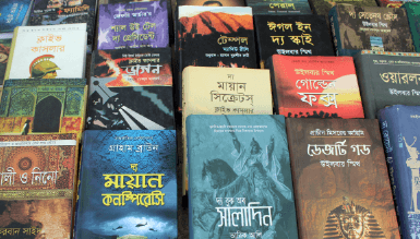
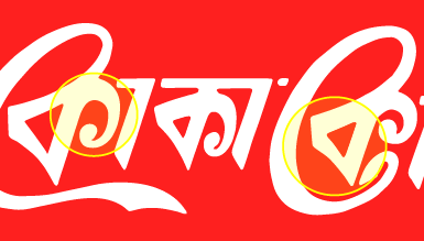
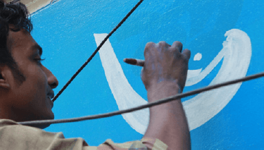
In my city of Rajshahi, there are well over a dozen sign-painting businesses, painting largely on fabric banners, metal signs and building walls.  Across this city I’d estimate that roughly half of all the text people encounter is hand-painted, showing how influential and pervasive it is.  While much of this hand-lettered type mimics existing computer fonts, there are regular interesting exceptions.  The most common embellishment distinctive to hand-lettered signs is the exaggerated forward curve at the bottom terminal of the verticals:

A few years ago a project in India called HandPaintedType attempted to create fonts based directly on sign-painting and sell them for $50 a font, but after three years it seems that it hasn’t developed very far.


Book Covers at the Dhaka Book Fair

As I’ve been researching Bengali calligraphy and display types, book covers can be a source for new inspiration, although the vast majority certainly just use Bengali Linotype font clones. So the day after একুশে ফেব্রুয়ারি (International Mother Language Day, Feb 21st) I braved the traffic with my camera to visit the Boi Mela, the country’s largest and best book fair.

Types

Probably about fifty percent of book covers use the standard Linotype Bengali typeface, while another third use one or another of the locally available fonts, generally pretty poor quality. I didn’t see any typefaces from outside Bangladesh, such as Adobe Bengali, Nirmala, Noto Sans, or ITF’s Bengali typefaces.

There were a number of historical revival display typefaces, most with a feeling of ornament being arbitrarily tacked on and unrealistic calligraphic strokes.

Historical-revival

Others tried to reproduce the feel of letterpress types from a previous era:

Historical-revival-2

Lettering

The hand-lettered titles mostly had either an extremely blocky feel to the point of being illegible or else excessive curls, which is something you see a lot in contemporary commercial graphics in Dhaka.

blocky

Calligraphic

A lot of the calligraphic titles looked to be done with a square-tipped marker, and a few were quite well-proportioned and interesting.

calligraphic

Much of the calligraphy however has awkward letter-forms and an inconsistency of style and stroke:

Free-script

The norm for Bangladeshi calligraphy has been to redraw the calligraphy as a vector shape, and then give it a slightly offset shadow. While this gives a decisive line, it loses the beauty of the hand-drawn calligraphy. Oftentimes the “vectorized” calligraphy is simply drawn as an weighted stroke (perhaps with Illustrator’s ‘calligraphy brush’), further reducing the expression of the calligraphy:

monolinear calligraphy

Many of the calligraphic titles were so poorly done that it would have been better to have used the standard Linotype Bengali text face:

poor-calligraphy

As always, the late Qayyum Choudhury’s distinctive calligraphy outshines all the others in maturity and originality of style:

qayyum-covers

There were a few other unique and interesting finds out there:

new-interesting

Bengali versions of global brands

Coca-cola

Being that Coca-cola is probably the world’s most famous logo, I was quite disappointed to see how poorly executed the Bengali translation of Coca-cola is:

Logo-improvements-Cocacola
  • The original Latin-script logo is characterized by a flowing cursive script with high contrast. Although cursive script is very common and legible in Bengali, this seemingly obvious choice was neglected in favor of a very angular, blocky style which is quite the opposite of the original logo. Even within the current Bengali version, the flowing calligraphic curves of the two “C”s (o-kaars) look awkward juxtaposed with the angular style of the remaining letters.
  • Specifically, the triangle of the “ka“s are often written in Bengali calligraphy and lettering in a much more rounded form which naturally matches the original logo’s “o”s, but this opportunity has not been used.
  • The right-hand terminals of the “ka“s appear excessively small and curved much too far around, while the lower terminal of the second “C” (o-kaar) appears unnaturally compressed
  • The uneven and broken matra (headline) over the “la” somewhat echoes the original’s upper-right element, but it negates any gains in legibility that a non-script type style would have made.

It seems like Coca-cola have already modified their Bengali logo once, so I hope they will consider a further and more radical change to match the original!

Likewise, the ‘Coke’ logo used for the diet version is disappointing, using a very different style of typography than the Latin original with poor legibility. The below

Coke-03

Aquafina

The Bengali version of Pepsico’s mineral water brand similarly seems ill-matched to the original logo’s style:

Logo-improvements-Aquafina

  • The original Aquafina logo is characterized by a highly legible and traditional typeface, somewhere between a vertical-axis transitional with a touch of slab-serif. The natural type style for the Bengali version would seem to be something congruous to an elegant compressed Linotype Bengali. However, instead of this, an extremely informal boxy style akin to the “Curlz” font has been used.
  • In the original logo, the initial and final “A” break above the headline, but the Bengali elements used to mirror this appear ill-matched
  • The excessively large counter space in the initial Bengali “aa” appears awkward, and the perpendicular joint of the Bengali “na” to the vertical stem makes it look more like a Hindi ‘na‘ and hinder legibility; both have a very uneven color.

I spent a little time developing a Bengali version which I think better reflects the feel of the original Latin version.