There’s not a lot written about Bengali type design, so I’d like to provide a reading list for anyone who is interested in learning more.
 The Printed Bengali Character: Its Evolution (Fiona Ross)
Summary: This 200+ study by University of Reading professor Fiona Ross is a treasure for not only the study of Bengali typeface design but non-Latin typography in general. Together with Tim Hathaway, Fiona Ross were commissioned in the early 1980’s by Kolkata’s Anandabazar Patrika to redesign a Bengali typeface, and their design has subsequently become the quintessential Bengali typeface today, though usually under other pirated names. This volume traces the history of Bengali print typefaces, from calligraphic origins, through the very first initiatives by Charles Wilkins, through the prolific missionary presses at Serampore, documenting in detail the successive fonts and their relative merits and limitations. The study focuses especially on the way historical technologies’ constraints and misunderstandings formed the characteristics of each era’s fonts. The latter part of the book describes the process of designing Anandabazar Patrika’s font and the key role of the phonetic keyboard in the digitization of Bengali type. This volume has become a classic exemplary text, not only for Bengali but also for non-Latin typeface design background research in general.
Details: Ross, Fiona. The Printed Bengali Character: Its Evolution. London: RoutledgeCurzon, 1999. Book.
Availability: The only place I could find it was at the University of Minnesota Library
 Linotype Bengali and the digital Bengali typefaces (Riccardo Olocco)
Picking up from 1982 where Ross’s Printed Bengali Character history left off, Olocco has researched the contemporary state of typeface design from 1982 until the present, highlighting the major typefaces. He begins with summarizing the earlierThere is a lengthy discussion of the issues in local typography, the lack of text typefaces, and the technological and institutional barriers to the emergence of quality Bengali type design in India. This is followed by a summary and critique of around ten Bengali typefaces designed in the last twenty years, most with connections to Western institutions. It is a great resource of documentation of recent type design initiatives – their strengths, shortcomings, and influences. Like most such studies, the research entirely omits the Bangladeshi scene where the majority of Bengali-speakers are. Nonetheless, this is an excellent source of background information on the major Indian and international Bengali typefaces of the last decade or two, and seems very thorough and relatively unbiased.
Details: Olocco, Riccardo. Linotype Bengali and the digital Bengali typefaces: With an enquiry into the current state of Bengali typesetting (Unpublished Masters Dissertation). University of Reading, 2014. Web. 7 Oct 2015.
Availability: full online download
 Amar Bornomala o Shomoshamoyik Bangla Typography (Nazimuddaula Milon)
Written in Bengali, this 68-page MFA thesis describes Milon’s typeface design project for Axiata Telecom along with a number of other smaller typography projects he worked on. The central part is a broader discussion of the state of Bengali typography in Bangladesh, especially the technological and institutional challenges and the trends and projections for the future. He critiques the complacency of the local institutions (such as the Bangla Academy) for not taking more initiative in type development, and discusses constraints of prevalent typesetting technologies in Bangladesh. The paper concludes with projections for the future and a call for Bangladeshi designers to take more of an active role in the development of Bengali type. This thesis is a very good insight into the contemporary state of typography at Bangladesh’s leading graphic design program. Since I encountered this article a few months ago, I have met with the author and his professor at Dhaka University and discussed the article in more detail personally.
Details: Milon, Nazimuddaula. Amar Bornomala o Shomoshamoyik Bangla Typography (Unpublished Masters Dissertation). Dhaka University, 2010. Web. 11 Nov 2015.
Availability: Read online via issuu.com here
 Non-Latin scripts: from hot-metal to digital type (Fiona Ross and Vaibhav Singh)
This book from the St Bride Library provides a detailed overview of the typographical issues of non-Latin scripts and typeface design. With articles by Paul Luna, Graham Shaw and Fiona Ross, the book gives extensive visual documentation from the St Bride Library collection of non-Latin typesetting. In the first section, Graham Shaw outlines the history of how various non-Latin scripts first encountered print and developed into typography. In the second section, Fiona Ross gives a visual chronicle of issues in non-Latin type design. The final section is especially relevant, an article by Fiona Ross on the key issues in type design for non-Latin scripts – the design brief, character repertoires, establishing dimensions, mark positioning and kerning, spacing, and harmonization with other scripts. The book finishes with a discussion of the importance of developing visual sensitivity and the value of calligraphy practice and research into manuscripts and early type design as a source for inspiration and guidance.
Details: Ross, Fiona and Singh, Vaibhav (eds) Non-Latin scripts: from hot-metal to digital type. London: St Bride Library, 2012.
Availability: I had to order it directly from St Bride’s Library in the UK and have it sent to the US.
Going Global: The Last Decade in Multi-Script Type Design (Gerry Leonidas)
From a faculty member of the world’s leading typeface design program this overview of current issues in non-Latin type design is a treasure of insight. It outlines the stages of global typeface design from the predominance of Latin forms and perspectives to the blossoming of research which has liberated these traditions. In the first stage (‘getting fundamentals right’), we learn about how designers and major institutions began to question the hegemony of Latin scripts and seek to develop non-Latin scripts. The second stage (‘linear families’) saw publishers coming to the forefront in commissioning non-Latin scripts, needing not just one font but families with a range of weights and widths. At stage 2 ½, minority scripts are being developed, non-Western type foundries are flourishing, and innovative typographic families of fonts are maturing. This article is a treasure for indicating from an authority in the field what the trends are in non-Latin typeface design.
Details: Leonidas, Gerry. “Going Global: The Last Decade in Multi-Script Type Design.” Typographica. October 15, 2013. Web. 7 Oct 2015.
Availability: Online via typographica.com here.
Articles
Digital typeface design and font development for twenty-first century Bangla language processing (Fiona Ross)
The most recent publication from Fiona Ross, this fifteen-page article provides a summary of the key considerations that factor into successful contemporary Bengali typeface design. These include technological restrictions, the design brief, character set, character fitting, typeface dimensions and tools. A very helpful presentation of the design issues unique to Bengali typeface design, with much material that is not available in her other publications. Of special interest are the factors involved in considering character fitting, such as the significance of extremely high or low conjuncts in defining the overall height. Ross explains the different types of type for newspapers, books and screens, and how low-contrast and high-contrast fonts fulfill the criteria for each type application. Also the author provides her perspective on the key letters to begin a design with, the key factors and considerations of the design. The article is the opening part of a volume on Bengali language processing issues.
Details: Ross, Fiona. “Digital typeface design and font development for twenty-first century bangla language processing.” Technical Challenges and Design Issues in Bangla Language Processing (2013): 1-15.
Availability: You can see part of it via Google Books here, but the best way to get the full article is to buy that chapter direct from the publisher here ($30) and download the pdf.
Non-Latin typesetting in the digital age (Fiona Ross)
This article summarizes the unique issues that non-Latin typesetting faces, notably large character sets, complex positioning rules and therefore prohibitive design costs and technological constraints. She describes how in the nineteen century the trend for non-Latin scripts was to reduce the number of characters and simplify, and this led to an extreme dichotomy between chirography and print in India to the point where they were mutually unintelligible. The author charts the history of how these problems have been faced since the beginning of printing through the emergence of the digital age and now the contemporary scene. Since the emergence of digital and phototypesetting, the opportunities have expanded such that excellence in non-Latin type design are both desirable and realizable. Extensive examples are given from Bengali, Urdu, Thai, Devnagari and other scripts. This article shows some of the key benefits and opportunities that the digital age has opened up for Bengali typeface design.
Details: Ross, Fiona. “Non-Latin typesetting in the digital age.” Computers and Typography 2, Volume 2 (2002) Bristol: Intellect Books.
Availability: I could only find part of the article in google books here.
Image Making of the Letter Forms. Inspiration from Indian Image Making for Font Design (Bokila Prasad and Shilpa Ranadeb)
Expressing a need for new inspiration in Indic typeface design, the author proposes the Indian traditional proportions and grid systems of image/idol-making as an inspiration for typefaces. The first few pages describe how traditional idol-making in India uses a very specific grid system to manage and describe proportions. These insights are derived from the research of Alice Boner into medieval sculpture. The authors show the relevance this has for Indic scripts, in particular the use of an ‘angular grid’, meaning a target-shaped grid that is set at a defined angle. This is not exactly what is used in Indian sculpture, but a simplified version of it. This can help guide letterform formation in Bengali scripts. The article is a good expression of what current thought and practice is in the Indian University context regarding Indic typeface design inspiration, and as such reveals some areas of focus and exploration that haven’t been adequately pursued, such as contemporary calligraphy and lettering.
Details: Bokila, Prasad and Shilpa Ranadeb. “Image Making of the Letter Forms. Inspiration from Indian Image Making for Font Design” ICORD 11: Proceedings of the 3rd International Conference on Research into Design Engineering, Bangalore, India, 10 Jan 2011. Web. 10 Oct 2015.
Availability: Read or download in full from the designsociety.org website here.
Anatomy of Bengali Letterforms: A Semiotic Study (Subhajit Chandra, Bokil Prasad, and Udaya Kumar Dharmalingam)
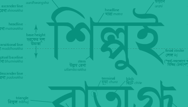
Whereas Latin and Arabic scripts have a long-established vocabulary of typographic forms such as ‘bowl’ and ‘ascender’, such a vocabulary has not yet been developed for the Bengali alphabet to date. This short study attempts to define a grid and vocabulary of features and elements of the Bengali script using both anatomical and organic vocabulary. While this is a much-needed contribution to Bengali typeface design, I feel that their neglect of the Bangladeshi context weakens their solution. The majority of Bengalis live in Bangladesh, and it is beginning to take a leading role in Bengali typeface design, with a distinctly different style of typefaces in use, and yet this study claims the Bengali-speaking population there to be “15 million” rather than the actual 150 million. Furthermore, I think the choice of exclusively English terminology with no reference to Bengali terms hinders the widespread acceptance of these terms, especially since no discussion was made of pre-existing Bengali terminology (such as “উড়ানি urani” for the ascending swash curve).
Details: Chandra, Subhajit, Prasad Bokil, and Dharmalingam Udaya Kumar. “Anatomy of Bengali Letterforms: A Semiotic Study.” ICoRD’15 – Research into Design Conference. Jan 2015, IISc Bangalore. Web. 7 Oct 2015.
Availability: Read or download in full from the researchgate.netwebsite here.
Bengali Types and Their Founders (Katharine Smith Diehl)
More of historical interest, this article has largely been superceded by Fiona Ross’ research.
Details: Diehl, Katharine Smith. “Bengali Types and Their Founders”. The Journal of Asian Studies 27.2 (1968): 335–338. Web…
How the Giriśa Vidyāratna Press Acquired Its Fonts: A Supplement to the Work of Fiona G. E. Ross (Brian A. Hatcher and Fiona G. E. Ross)
A small supplement which explains some points that were missing from Fiona Ross’ earlier book.
Details: Hatcher, Brian A., and Fiona G. E. Ross. “How the Giriśa Vidyāratna Press Acquired Its Fonts: A Supplement to the Work of Fiona G. E. Ross”. Journal of the American Oriental Society 121.4 (2001): 637–639. Web…
Availability: JSTOR is where I read it.
A review of legibility studies and its implication to Indic scripts (Subhajit Chandra and D. Udaya Kumar)
This brief one-page visual study transfers Latin legibility research findings to the Bengali script, such as insights on stroke density, crowding, common area and terminals. It encourages the need for more study on Bengali legibility.
Details: Chandra, Subhajit and D. Udaya Kumar. “A review of legibility studies and its implication to Indic scripts.” Typography Day 2015 Conference. March 2015, IIT, Bombay. Web. 7 Oct 2015.
Availability: Download pdf from researchgate.net here.
Reading Bengali: A study of typeface readability and legibility for on-screen texts (Subhajit Chandra and D. Udaya Kumar)
An attempt to test legibility for Bengali scripts; I find the results hard to believe, since it ranks Vrinda as more legible than SolaimanLipi (a Linotype Bengali clone). Perhaps the participant quantity was not sufficient, I’m not sure.
Anatomy of Devanagari typefaces (Girish Dalvi)
Girish Dalvi is a professor of design at IIT Bombay, where he completed his PhD research in Devanagari Typography. He has designed a number of significant typefaces, including the Bengali typeface Star Bengali. Since unlike Latin scripts, Indic scripts do not have a standardized vocabulary for describing letterforms, this paper sets out to establish this vocabulary for the Devanagari script. The method used is to review and evaluate the vocabulary used to date by other previous authorities in the field, namely Bhagwat and Naik, M W Gokhale, and Mahendra Patel. The bulk of the article is describing the similarities and differences between the vocabulary of these authorities. The paper is relevant to Bengali typeface design because there is a need for a standardized vocabulary to describe Bengali letterforms, and often Devanagari nomenclature has been inappropriately used. This source helps to establish what terms are similar and which terms carry totally different meanings in these scripts (such as ‘matra’ and ‘shirorekha’).
Details: Dalvi, Girish. “Anatomy of Devanagari typefaces.” Des. Thoughts 1.1 (2009): 30-36.
Availability: Read or download the full pdf from the IIT website here.
Devanagari in Multi-Script Typography (Vaibhav Singh)
In this third millennium the frequency of multi-script texts both in Bangladesh and abroad necessitate the design of Bengali scripts which integrate stylistically with Latin scripts, yet this is a surprisingly elusive goal. ‘X-height’, headlines, overall color and stroke angle all inhibit integration of scripts. This dissertation focuses specifically on the combination of Devanagari scripts with Latin, but the underlying principles are very relevant for Bengali which is closely related to Devanagari. The author examines the role of the design brief, then technological constraints, and thirdly the history of how colonial governments and missionaries pioneered multi-script printing. Historical examples of multi-script families are critiqued and new insights drawn on key factors in multi-script families. It is very common for Bengali texts to contain words set in Latin type, and this resource is very helpful for guidance in regard to how to maximize compatibility and even color in such situations.
Details: Singh, Vaibhav. Devanagari in Multi-Script Typography (Unpublished Masters Dissertation). University of Reading, 2011. Web. 21 April 2016.
Availability: Read it on issuu.com here.

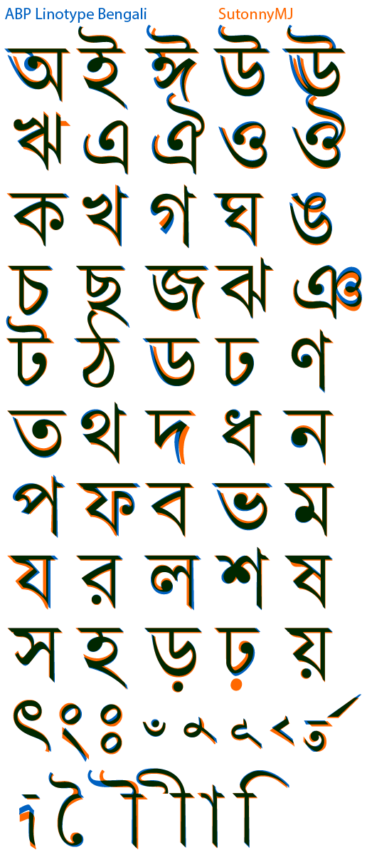
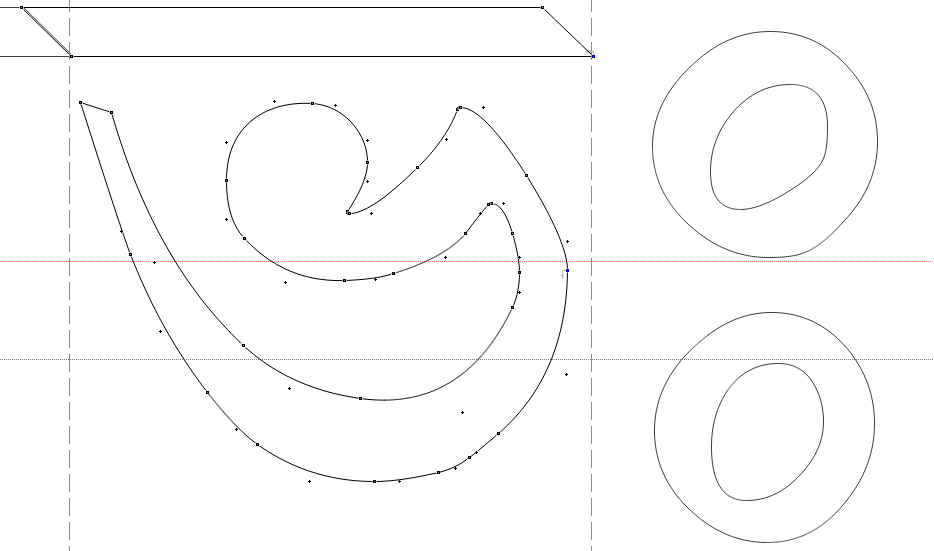
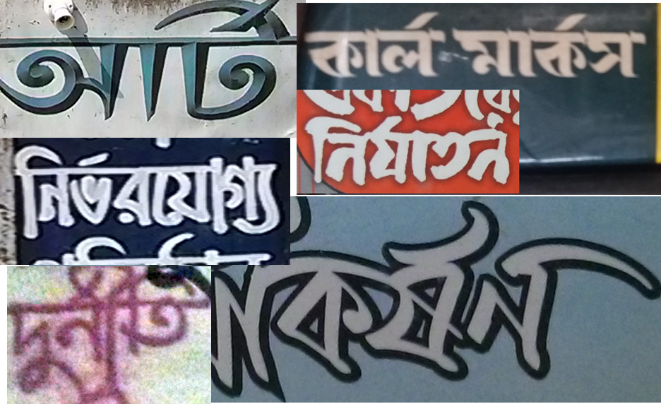
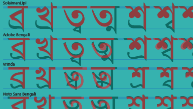
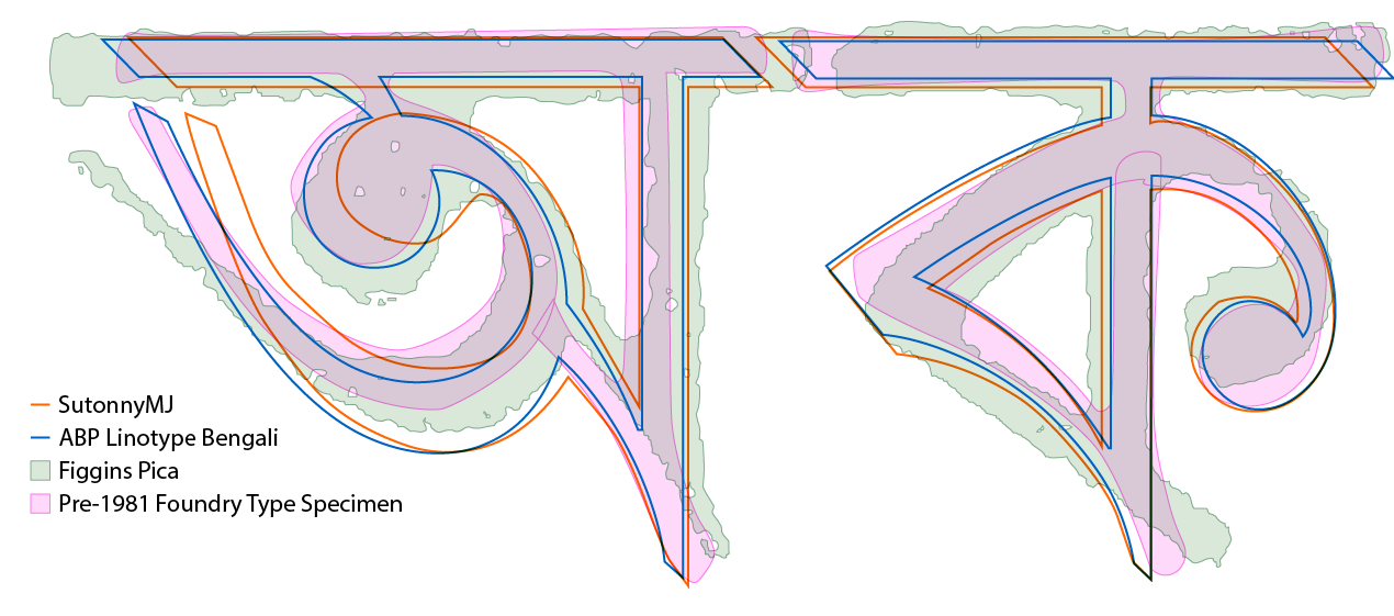 As you can see, the letterforms are basically identical, with minor adaptions. Apparently Mustafa Jabbar had criticized Solaiman Karim a decade ago for copying his letterforms in the free font ‘SolaimanLipi’ (which are indeed crudely-made carbon copies!).
 I can quickly distinguish between SutonnyMJ and Linotype Bengali – does that mean Sutonny is an original design?
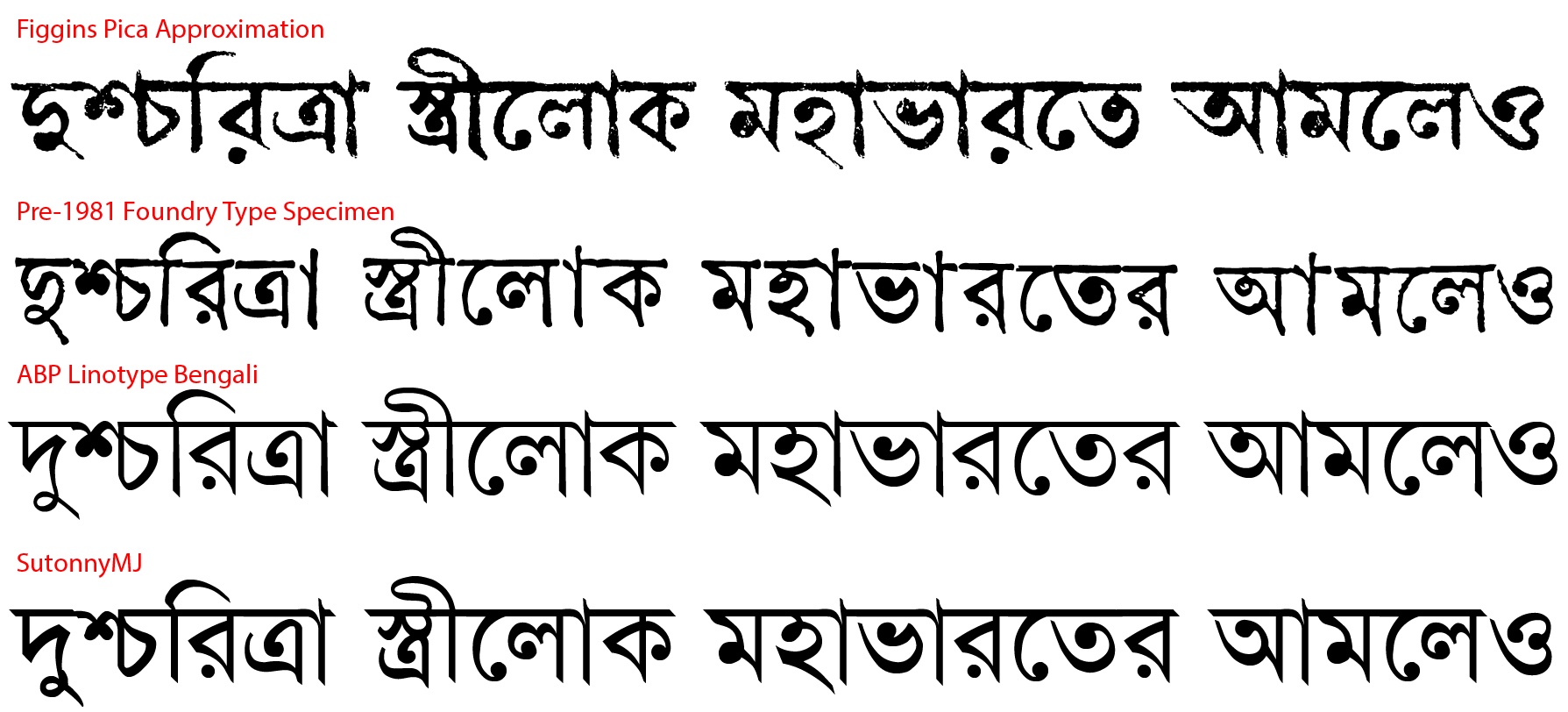