
One area in Bengali type where there’s no standard practice is in the positioning of the reph. The reph is an ‘r’ which precedes a consonant, and it is written as a diagonal slash above the consonant. However, some fonts center the reph over the letter, some align it with the connecting stem, others align it a certain distance from the letter’s left side bearing:
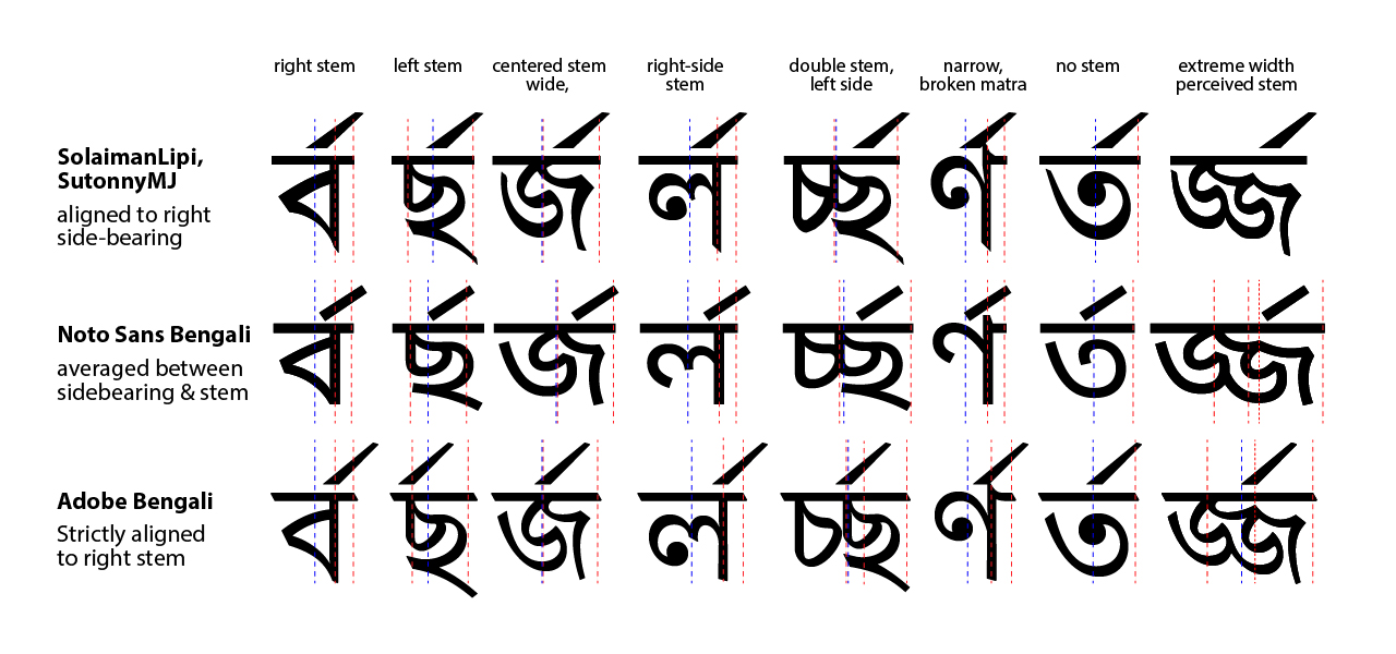
 Reph positioning above the character cha illustrates the differences most vividly. While most types position the reph on the left side of the cha, Adobe’s 2013 Bengali typeface aligns the reph with the left stem of the ‘cha’ (Fig 6).
From a legibility perspective, these are very significant differences, because to readers accustomed to seeing the reph to the right, Adobe Bengali’s alignment of the reph with the left-hand stem could seem to associate the reph with the preceding character and cause serious confusion.
It seems to me that the reph positioning around consonant clusters can affect legibility and meaning. So what is the best method for reph placement? To determine this, I looked at a wide variety of manuscripts to see what approach is used in traditional Bengali handwriting:
 While there is a lot of variety, it seems like the dominant approach is to align it with the right side-bearing of the previous letter, somewhat more centered for extra-wide letters. This is the case for virtually all Bengali fonts made in Bangladesh I have seen. This seems to also be the practice in historical forms of type, often due to technological constraints:
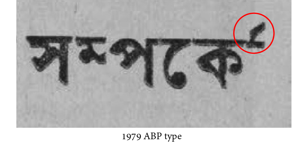
 In some historical type forms from a century ago, the reph is positioned radically to the right (“সম্পর্ক” above), which many present-day readers are still familiar with. This further corroborates our theory that alignment with the right side-bearing is preferable. [2019 note: I did find an example of more left-positioned rephs in a 1969 foundry type book by Indian Associate Publishing in Kolkata.]
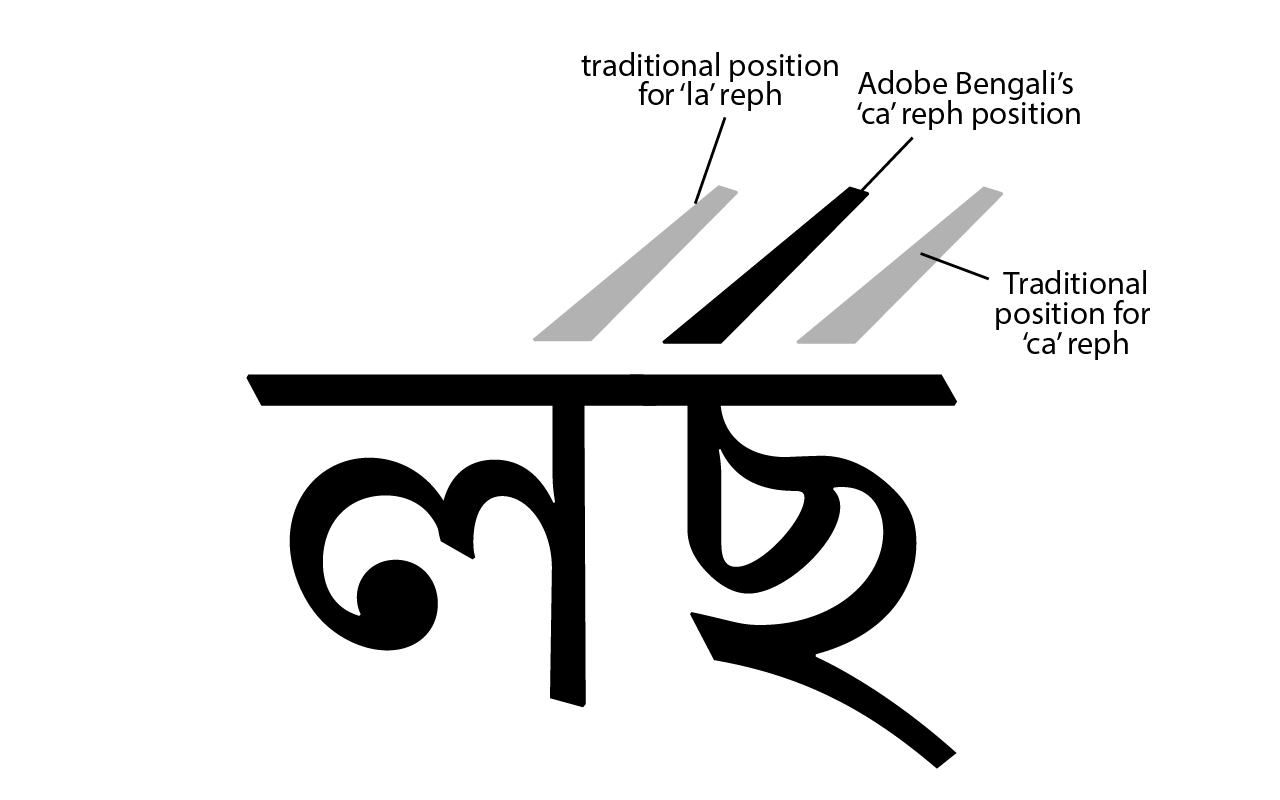
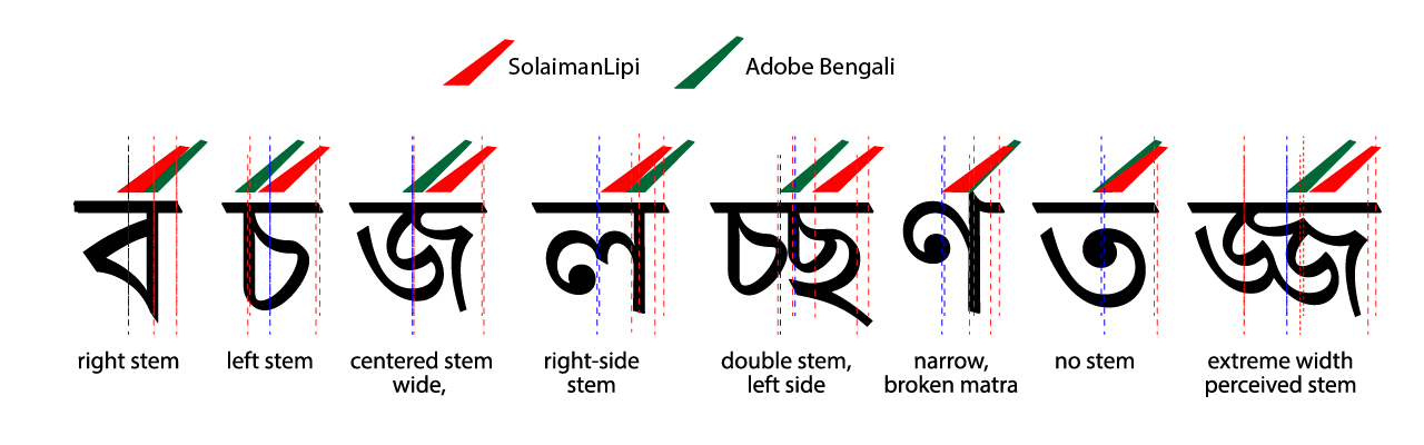
However, following a contemporary strand of chirographic teaching, Adobe Bengali aligns the reph with the letter’s stem (whether left or right) but this approach seems problematic to me. Letters are viewed holistically, and the placement of the stem is visually insignificant, especially since a significant amount of letters do not even have a stem. Here’s a graphic that compares Adobe Bengali’s reph positioning with the standard practice in Bangladesh:
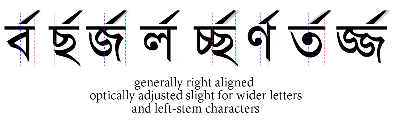
 So my proposed solution is to set the reph generally aligned to the right side-bearing, but optically adjusted slight for wider letters and left-stemmed characters:
 Here’s some extra reph positioning examples thrown in from contemporary sign-painting and calligraphy in Bangladesh, though it really doesn’t have much bearing on this discussion:
 [Added March 2019:] John’s comment below about a West Bengal publisher suggesting a left-aligned reph position brought to mind a similar revision with the 2017 Modern Bangla Dictionary from the Bangladesh Bangla Academy. The introduction states:
“কোনো ব্যঞ্জনের পূর্বে র যুক্ত হলে র-এর যুক্ত রূপকে রেফ বলা হয় এবং রেফ চিহ্ন ব্যঞ্জনের আরম্ভে দেওয়া সংগততর। এই যুক্তিতে বাংলা একাডেমি আধুনিক বাংলা অভিধান-এর বর্তমান সংস্করণে রেফ-এর অবস্থান একটু বাঁ দিকে সরিয়ে আনা হয়েছে।”
(my translation: “When a ‘ra’ is joined before another consonant its form is called reph, and placing it at the start of that consonant makes sense. Following this logic Bangla Academy’s current edition of the Modern Bangla Dictionary has moved the placement of the reph a bit to the left.”)
The actual implementation looks like this:

As my yellow highlights show, the font uses a fixed distance reph character regardless of letter width, which makes reph placement appear centered for wide characters (like জ) and extreme left for narrow characters (like ণ). It seems like an anchor attachment would have been more appropriate in this case. The BA’s newest dictionary also reverts to a lot of simplified conjuncts which often cause uneven color and overlaps.
