In one sense, suggesting Bengali italics is as incongruously Eurocentric as speaking of Bengali ‘serif’, ‘sans-serif’ or ‘roman.’ It ignores the unique historical tradition of Bengali typography, and artificially slaps an alien historical tradition on top of it. Or does it? What I call ‘monolinear cultural evolutionism’ (the idea that all cultures will gradually evolve along the trajectory the West has) is clearly false and objectionable, and this mentality has led to a lot of silliness in typography. However, there’s also the overreaction of cultural purism or the ‘zoo’ mentality that attempts to dogmatically purge cultural traditions of all outside influences, and that doesn’t reflect the complex interrelations between cultural traditions.
I’d like to suggest that italics are an essential part of any quality Bengali typeface today, simply because they are so widely used and provide a layer of richness to the text. The introduction of punctuation into Bengali is a helpful analogy – early Bengali did not have spaces or punctuation, but the missionary printing presses introduced it and Vidyasagar popularized it, and now this ‘foreign influence’ has become an integral part of the Bengali language, albeit with slightly modified rules.
Although italics (তির্যক) have not traditionally been a part of Bengali typography, it is increasingly becoming mainstream according to English norms. Oblique forms are used by such convention-setters as the Prothom Alo (the most widely-read Bengali newspaper in the world), the Bangla Academy dictionaries (the authority in Bangladesh for spelling and grammar), and many other publications. However, to date these ‘italics’ are all simply oblique forms of the regular fount, thus harder for readers to differentiate from the regular text and ultimately hurting both legibility and beauty. The stylistic differentiation is important for visually distinguishing the italic text from the regular ‘roman’ type.
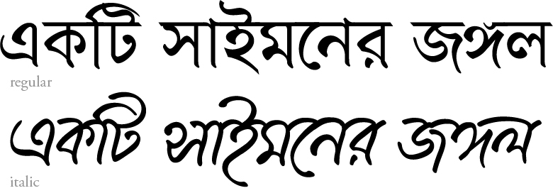
So I’d like to suggest an italic form for Bengali typefaces based on cursive Bengali script with the following common cursive characteristics:
- a curvilinear headline/matra seems very appropriate for Bengali italics
- a simpler rounded urani ascender which doesn’t curve upward at the terminal, and similarly simpler raphalas
Conveniently, last year I designed a script typeface that can be adapted as an italic version of the continuous text face I’m currently working on:

