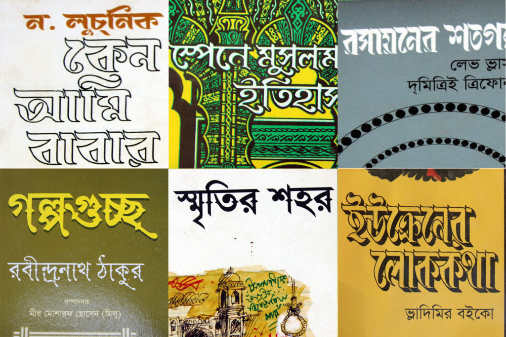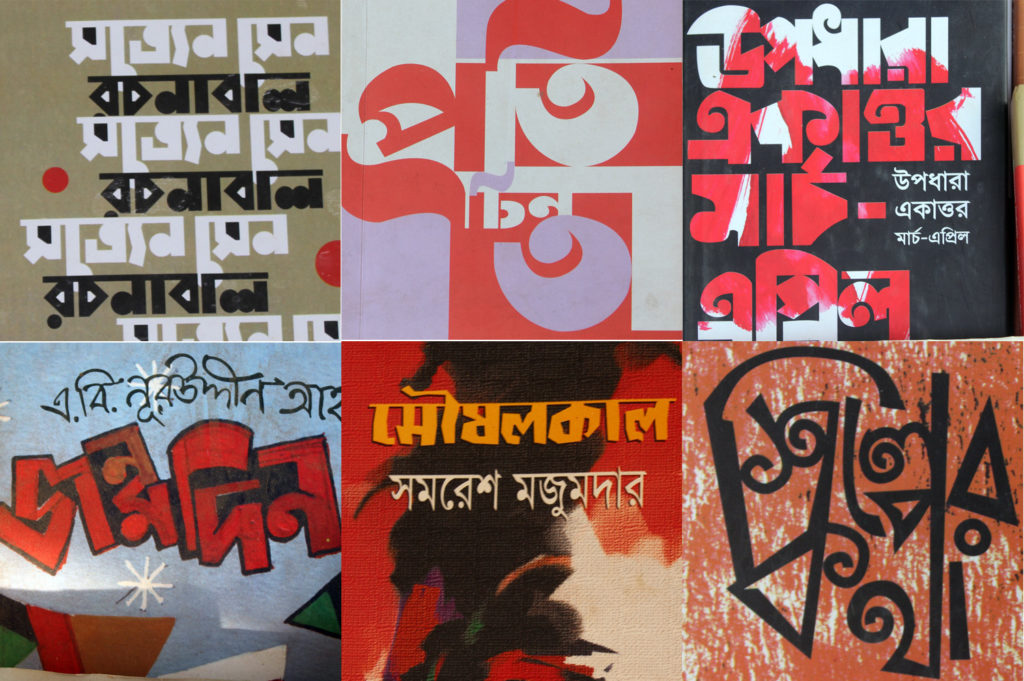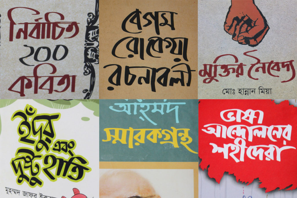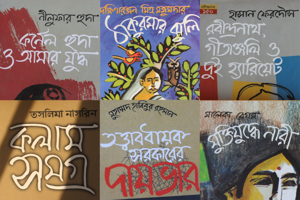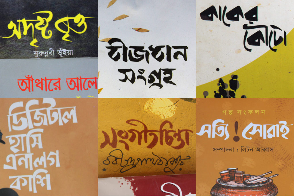
As I’ve been researching Bengali calligraphy and display types, book covers can be a source for new inspiration, although the vast majority certainly just use Bengali Linotype font clones. So the day after একুশে ফেব্রুয়ারি (International Mother Language Day, Feb 21st) I braved the traffic with my camera to visit the Boi Mela, the country’s largest and best book fair.
Types
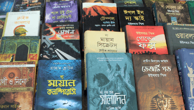
Probably about fifty percent of book covers use the standard Linotype Bengali typeface, while another third use one or another of the locally available fonts, generally pretty poor quality. I didn’t see any typefaces from outside Bangladesh, such as Adobe Bengali, Nirmala, Noto Sans, or ITF’s Bengali typefaces.
There were a number of historical revival display typefaces, most with a feeling of ornament being arbitrarily tacked on and unrealistic calligraphic strokes.
Others tried to reproduce the feel of letterpress types from a previous era:
Lettering
The hand-lettered titles mostly had either an extremely blocky feel to the point of being illegible or else excessive curls, which is something you see a lot in contemporary commercial graphics in Dhaka.
Calligraphic
A lot of the calligraphic titles looked to be done with a square-tipped marker, and a few were quite well-proportioned and interesting.
Much of the calligraphy however has awkward letter-forms and an inconsistency of style and stroke:
The norm for Bangladeshi calligraphy has been to redraw the calligraphy as a vector shape, and then give it a slightly offset shadow. While this gives a decisive line, it loses the beauty of the hand-drawn calligraphy. Oftentimes the “vectorized” calligraphy is simply drawn as an weighted stroke (perhaps with Illustrator’s ‘calligraphy brush’), further reducing the expression of the calligraphy:
Many of the calligraphic titles were so poorly done that it would have been better to have used the standard Linotype Bengali text face:
As always, the late Qayyum Choudhury’s distinctive calligraphy outshines all the others in maturity and originality of style:
There were a few other unique and interesting finds out there:
