In Bengali (and other abugida scripts), multiply consonants are often clustered together such as follows:

The problem is, when combined consonants are stacked vertically they sometimes extend too far down, and therefore designers often will compress them to fit within the base height. However, this can be taken too far and make letterforms seem unnaturally compressed.
The best practice is clearly something between these two extremes of:
- either not compressing conjunct parts at all, or
- compressing them rigidly into the base height
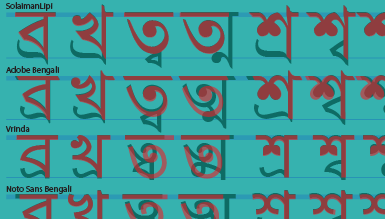
To analyse best practices in this regard, I have compared below some of the major Bengali typefaces that are in use today in how they address these issues. The translucent red shapes are the original consonant shapes superimposed on the black consonant-conjuncts:

It becomes clear that a lot of low-budget scripts designed in Bangladesh (SolaimanLipi and SutonnyMJ above) were formed by ASCII constraints, which meant not shrinking consonant conjuncts at all or shrinking them extremely (eg ত্ম). Vrinda falls into this same category. Adobe Bengali seems to emerge as the most nuanced and consistent in its treatment of conjunct resizing. Interestingly, a fount from the nineteenth century, Figgins Pica Bengali, seems rank higher than most all contemporary scripts in it’s care in resizing consonant conjuncts appropriately.
