Coca-cola
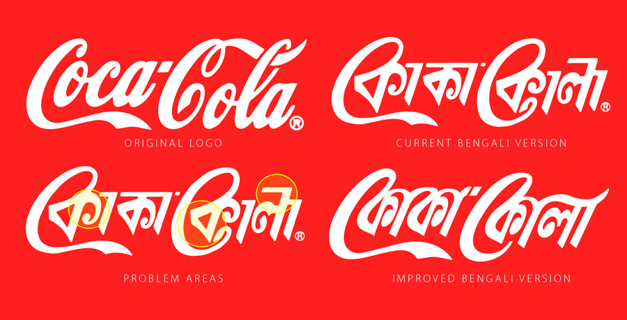
Being that Coca-cola is probably the world’s most famous logo, I was quite disappointed to see how poorly executed the Bengali translation of Coca-cola is:
- The original Latin-script logo is characterized by a flowing cursive script with high contrast. Although cursive script is very common and legible in Bengali, this seemingly obvious choice was neglected in favor of a very angular, blocky style which is quite the opposite of the original logo. Even within the current Bengali version, the flowing calligraphic curves of the two “C”s (o-kaars) look awkward juxtaposed with the angular style of the remaining letters.
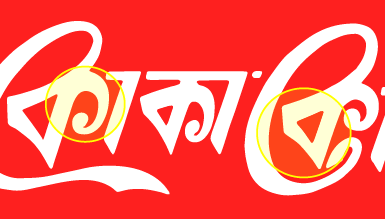
- Specifically, the triangle of the “ka“s are often written in Bengali calligraphy and lettering in a much more rounded form which naturally matches the original logo’s “o”s, but this opportunity has not been used.
- The right-hand terminals of the “ka“s appear excessively small and curved much too far around, while the lower terminal of the second “C” (o-kaar) appears unnaturally compressed
- The uneven and broken matra (headline) over the “la” somewhat echoes the original’s upper-right element, but it negates any gains in legibility that a non-script type style would have made.
It seems like Coca-cola have already modified their Bengali logo once, so I hope they will consider a further and more radical change to match the original!
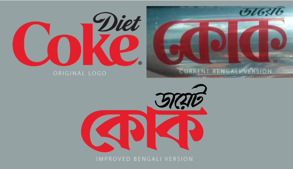
Likewise, the ‘Coke’ logo used for the diet version is disappointing, using a very different style of typography than the Latin original with poor legibility. The below
Aquafina
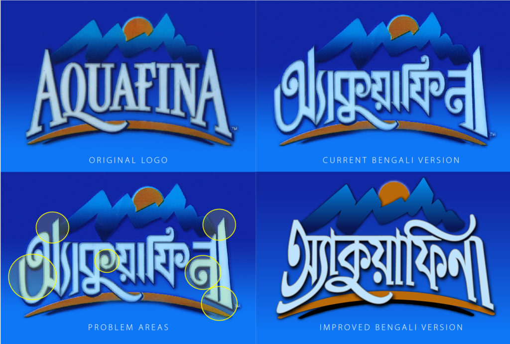
The Bengali version of Pepsico’s mineral water brand similarly seems ill-matched to the original logo’s style:
- The original Aquafina logo is characterized by a highly legible and traditional typeface, somewhere between a vertical-axis transitional with a touch of slab-serif. The natural type style for the Bengali version would seem to be something congruous to an elegant compressed Linotype Bengali. However, instead of this, an extremely informal boxy style akin to the “Curlz” font has been used.
- In the original logo, the initial and final “A” break above the headline, but the Bengali elements used to mirror this appear ill-matched
- The excessively large counter space in the initial Bengali “aa” appears awkward, and the perpendicular joint of the Bengali “na” to the vertical stem makes it look more like a Hindi ‘na‘ and hinder legibility; both have a very uneven color.
I spent a little time developing a Bengali version which I think better reflects the feel of the original Latin version.


আমি ফন্ট গুলো নিতে চাই তো কি ভাবে নিবো
আমি ফন্টগুলো নিতে চাই কিভাবে নিব
আমি কোকাকোলা বাংলা ফন্টটা নিতে চাই
Couldn’t agree harder! Thanks for the wonderful work.
impressive work , Best wishes
আমি ফন্ট গুলো নিতে চাই তো কি ভাবে নিবো