
The last few months I’ve been trying to design a versatile and original Bengali text face (ie fonts for long texts), which has prompted a lot of research into earlier foundry types and questions about originality. Bengali text face design is a unique challenge, because virtually every Bangladeshi book and newspaper that’s been printed over the last thirty years has used a clone of Fiona Ross and Tim Holloway’s 1981 ABP Linotype Bengali design. I’m addressing two questions in this post:
- Is Mustafa Jabbar’s SutonnyMJ simply a clone of Ross & Holloway’s ABP Linotype Bengali?
- How does one develop an original and acceptable Bengali text face when an entire generation has seen nothing but one one text face?
In this post I’m going to focus in on the most widely-used typeface in Bangladesh, SutonnyMJ by Mustafa Jabbar of Bijoy Keyboard. This font is everywhere in Bangladesh – street signs, ephemera, books. Is it a clone of Ross & Holloway’s Linotype Bengali? To help you judge, I’ve placed the two types side-by-side here along with two pre-1981 text faces:
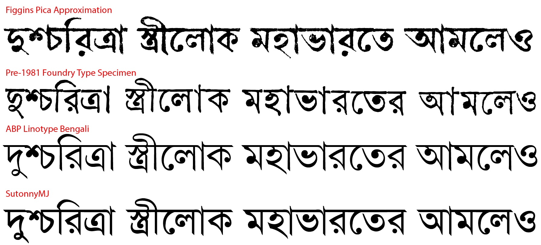
Besides being bolder than Linotype Bengali, there are little apparent differences as compared with previous typefaces pictured above. The only remarkable differences i have found so far are:
- A much wider da দ ABP
- Dropping the calligraphic connector stroke to the matra in a অ
Here’s another couple illustrations to help the reader compare SutonnyMJ with the original 1980’s Linotype Bengali designs:
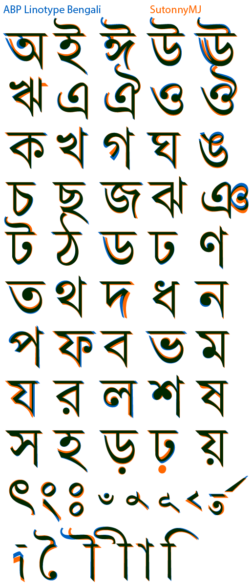
 As you can see, the letterforms are basically identical, with minor adaptions. Apparently Mustafa Jabbar had criticized Solaiman Karim a decade ago for copying his letterforms in the free font ‘SolaimanLipi’ (which are indeed crudely-made carbon copies!).
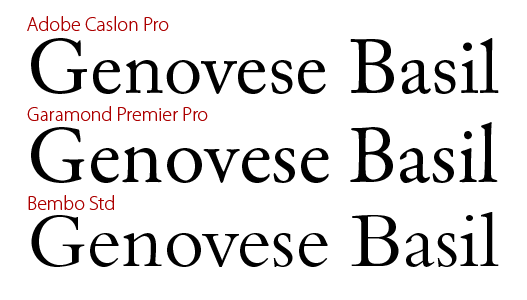
How different does a new text type have to be from its predecessors? How different are the following major Latin text faces?
 I can quickly distinguish between SutonnyMJ and Linotype Bengali – does that mean Sutonny is an original design?
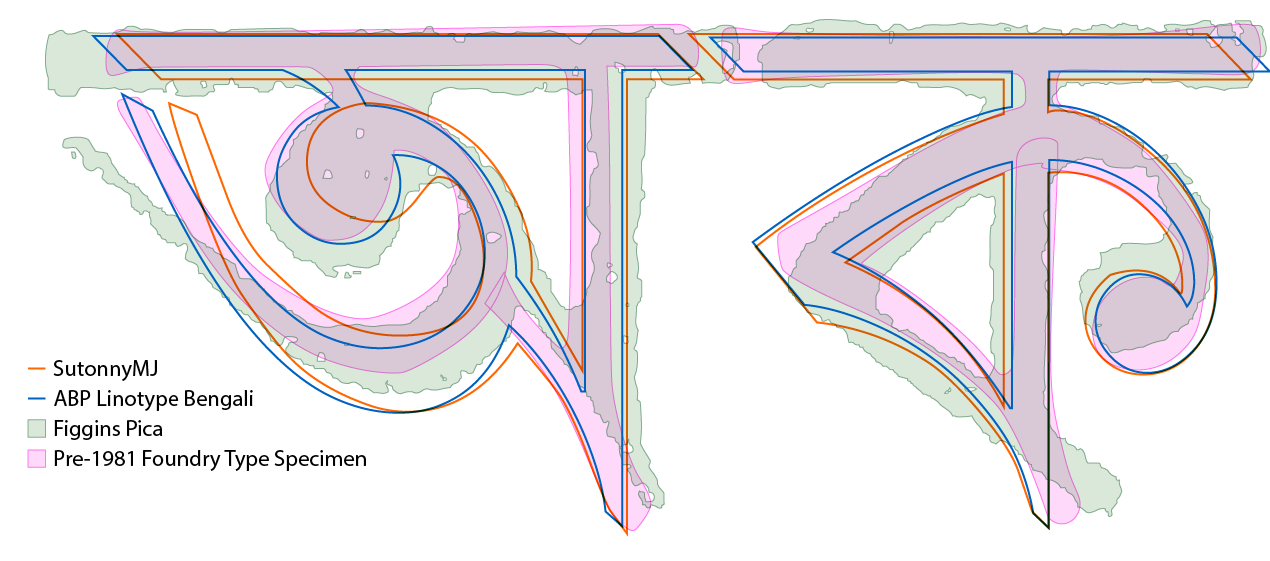
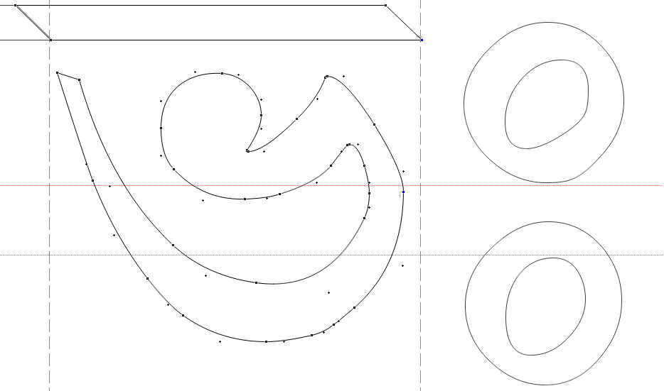
SutonnyMJ has a tremendous amount of issues, from overlapping glyphs to poor glyph shaping. Here’s a close-up snapshot of one glyph:
Plenty more could be said in criticism of this and other existing Linotype clones, but that’s beside the point.
How does one design an original, acceptable text face in an environment where any deviation from ABP Linotype is distracting to say the least? It’s a difficult tension – on the one hand, I don’t want to copy ABP Linotype, but significant deviations become so conspicuous.
I suppose it’s like how dominant Caslon’s type was in the eighteenth century – almost universally used in British printing.

Greetings! Very useful advice within this article! It’s the little changes which will make the greatest changes. Thanks for sharing!
You should look into the old handwritten text available in the museum or archives. Check the Tulika Bengali font out, to me, it is kind of different.